RGB vs CMYK: Choosing Colour Modes for Print Marketing Materials
There are two main colour modes used in professional design and marketing today: RGB and CMYK.
These two options seem similar to the untrained eye (after all, they both print in colour) but there are actually important distinctions between them — and these differences determine when they should be used.
Which colour mode is right for your color projects? Let’s find out!
RGB vs CMYK: What’s The Difference?
RGB and CMYK are different color models used in graphic design. In short, RBG colors should be used for digital design projects, and CMYK colors should be used for printed design projects. Here’s why:
What is RGB Color Mode?
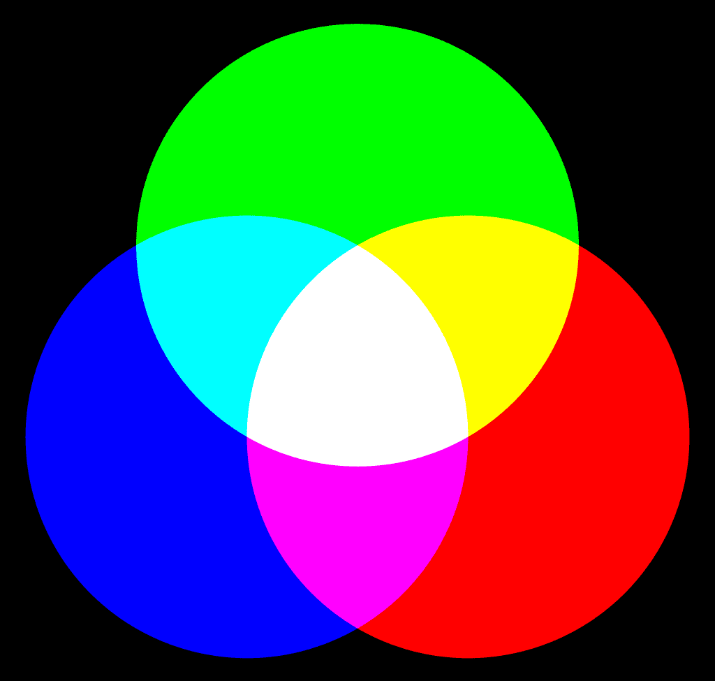
RGB stands for “Red, Green, Blue.” This colour mode creates a variety of shades and hues, simply by combining these three primary colors in varying degrees. RGB colour modes are “additive colors,” meaning they add more ink to the print in order to achieve your desired pigment.
RGB offers a smaller colour palette than CMYK (three colours vs. four) because it uses the colours found inside your electronic lights: red light, green light, and blue light. The light sources inside your computer, smartphone, or television use RGB color profiles in varying intensity to create the vibrant and vivid images on your screen.
By contrast, on digital screens, CMYK color profiles look washed out and dull.
What is CMYK Color Mode?
The CMYK color gamut includes cyan, magenta, yellow, key (key is another word for black). CMYK is what printing companies refer to as “four-colour printing.” It is what you’ll find in both your home printer and (in superior quality, of course) commercial printers.
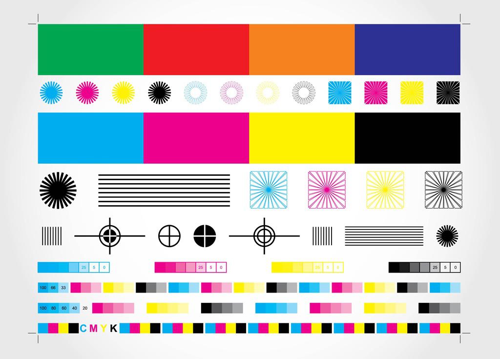
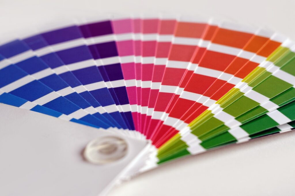
CMYK colour modes are “subtractive colors,” meaning it starts as a pure white combination of all colours, then subtracts ink to create a range of colors. This is the most common colour mode for printed marketing materials. It looks best on printed materials like signage, posters, business cards, direct mail, leaflets and brochures.
By contrast, when graphic designers convert RGB color profiles to printed materials, the final product tends to look dull and muddy.
RGB vs CMYK: When To Use RGB And CMYK Color Mode
When To Use RGB Color Mode
Here are a few projects that will benefit from using RGB:
Website Design
A company should optimize its website for the best possible viewing experience.
As people will always be looking at your website through some form of digital screen (their computers, computer monitors, phones, tablets, etc.), this is the perfect time to use RGB colours in your design.
If all images, infographics, and videos use RGB, they will be stunning and bright, which is sure to attract your audience’s attention.
Social Media
Once again, this is a medium that exists exclusively online. Social media posts are seen, shared, and discussed all in the digital sphere. So you should optimize them for digital screens.
This is particularly true for platforms like Instagram, which focuses heavily on aesthetically pleasing images. If you design a post meant for your business social media pages, make sure you use RGB!
Company Logos
Company logos are a crucial part of your brand identity. They need to look great and represent you both online and in printed marketing materials. For this reason, it’s wise to design two logos — one using RGB and another with CMYK.
Even if these two logos are identical (which they should be for a consistent brand identity), the two different colour modes will ensure you have the best possible logo wherever it happens to be.
When To Use CMYK Color Mode
CMYK is the ideal color space for a bright and colorful printed image — and since most printing companies use CMYK printers anyway, it’s best to plan accordingly during the printing process. You can use CMYK colour modes for any printed projects, such as:
Leaflets and Flyers
Leaflets and flyers need to catch the eye from across the room or down the road. The best way to do that is with striking visuals! A great colour poster printed with CMYK is certain to attract attention.
Just make sure to design your poster in a suitable file type; PDFs and AI (Adobe Illustrator) files are ideal for CMYK.
Business Cards
Business cards are another printed material that benefits from CMYK colour modes.
Your business card needs to look sharp and professional, with colours and font that match your brand identity perfectly.
Branded Merchandise
If you want your merchandise to look colourful and vivid — and, more importantly, match the branding on your company website — you will need to use CMYK colour modes when designing branded merchandise.
This includes all printed products, including stickers, t-shirts, and promotional mugs.
RGB vs CMYK Printing: The Best File Formats For Your Printed Projects
There are a few different file formats to choose from when printing your CMYK projects:
- PDFs will always turn out great with CMYK, and they are compatible with most design software.
- Adobe Illustratorfiles are the standard among graphic designers for CMYK projects.
- EPS files are also popular among graphic designers for CMYK projects.
Stay away from JPG and PNG files for CMYK projects, as they are not CMYK compatible.
Note: No matter what file formats you choose, always be sure that you’ve selected CMYK color mode in your design software, whether thats photoshop, indesign, or another design software.
CMYK: Right Choice for Your Print Marketing Materials
Creating a strong and consistent brand identity is an important part of helping your business thrive. But of course, creativity is only half the battle — you also need the right tools to create a professional finished product. If you need to create printed marketing materials that are as sharp and clean as they are creative, Banana Print is an excellent resource to help you succeed.
Take a look at our options for printing flyers, promotional gifts, business cards, and much more today.