
7 Best Fonts for Eye-Catching Business Cards
First published: 03 January 2020 | Updated: 14 September 2026
The best business card font depends on more than just legibility; it should reflect the impression you want to make. A graphic designer might reach for something distinctive and artistic, while a financial professional is usually better served by something simple and direct. Here are seven fonts worth considering, compared by style, readability, and who they suit best.
Quick comparison:
| Font | Style | Free or paid | Free alternative | Best suited to |
|---|---|---|---|---|
| Times New Roman | Serif | Bundled with most systems, licensed | Widely available already | Legal, academic, and traditional professions |
| Baskerville | Serif | Varies by source, check licence | Libre Baskerville | Law, publishing, heritage brands |
| Helvetica | Sans serif | Commercial, widely bundled | Arial | Almost any industry, safe default |
| Futura | Sans serif | Commercial | Jost | Tech, startups, modern brands |
| Myriad Pro | Sans serif | Commercial (Adobe) | Open Sans | Clean, minimal cards with logos or imagery |
| Leyton | Serif, decorative | Free for personal use, paid for commercial use | No widely-established free equivalent | Luxury, fashion, boutique brands |
| Black Caviar | Script | Commercial (Creative Market) | No widely-established free equivalent | Wedding, fashion, artisan trades |
What Information Does a Business Card Need?
At its most basic, a business card needs to do one simple thing: give the reader your name, your company name, and your contact information. However, a truly great business card does much more than that. It should reflect your professional persona and feature a design that reflects the quality of your work, while still walking a fine line between creativity and readability. If your card can’t be read, it can’t do its job, no matter how attractive the font looks.
What Makes a Good Business Card Font?

Before picking a font by name, it’s worth knowing what to look for. Business cards have specific requirements that don’t necessarily apply to a website or a poster.
- Legibility at small size. A business card gives you very little space, so a font needs to stay clear and distinct even at 8-10pt, well below the size most fonts are designed and tested at.
- Generous x-height. Fonts with a taller lowercase letter height (relative to the capitals) tend to hold up better at small sizes than fonts with a lower x-height, which can start to look cramped or indistinct.
- Print reproduction quality. Very thin strokes or fine decorative details can lose crispness once printed, especially on textured or uncoated stock, or with finishes like foil or embossing. A font that looks delicate and elegant on screen can print less cleanly than expected.
- Consistency with your brand. Your business card font doesn’t need to match your logo exactly, but a jarring mismatch between your card and your website or other materials undermines the professional impression you’re going for.
With those criteria in mind, here are seven fonts worth considering, organised by the impression each one creates.
Times New Roman

For many years, Times New Roman was one of the most popular fonts in the professional sphere, largely because it’s the default in Microsoft Word. It long predates the digital age, though, originally commissioned by The Times newspaper in 1931. With a clean, robust serif design, it remains an excellent choice for anyone wanting a simple, sophisticated business card, particularly in traditional professions like law or academia, where a classic look carries real credibility.
Baskerville
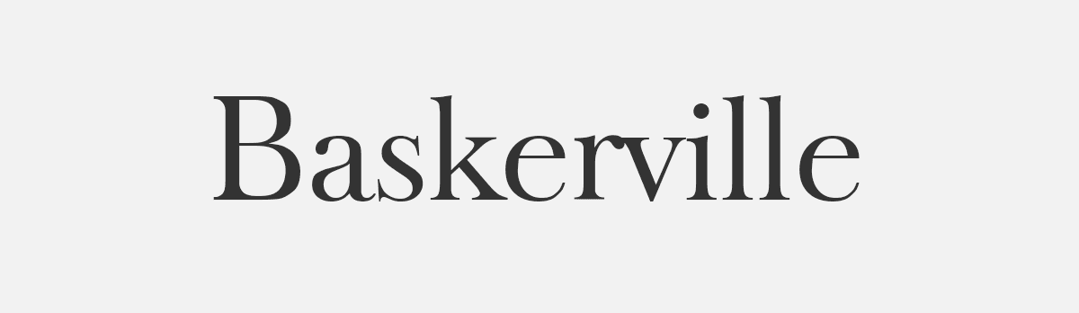
An elegant serif font dating back to 1757, originally developed in Birmingham. Despite its age, Baskerville has some genuinely modern qualities, tapered serifs and a vertical letter axis that keep it easy to read. If you want a business card that conveys old-school elegance, particularly well-suited to law firms, publishing, or heritage brands, this is a strong choice. Licensing note: specific digital versions vary by source; Libre Baskerville is a free, open-source alternative available via Google Fonts if you want the same feel without a licensing question.
Helvetica

Of all the sans serif fonts available, Helvetica remains the most dominant. This minimalist 1957 design looks clean and legible across a wide range of sizes, which is why it’s a go-to choice for business cards, letterheads, logos, and far beyond. As professional communication has become more digital, sans serif fonts like Helvetica have only grown in popularity. They tend to read more clearly on a screen than traditional serif faces. Licensing note: Helvetica is a commercial typeface; Arial is a very close, freely available alternative if you don’t already have access to it.
Futura

Another sans serif font, built around circular, geometric shapes with thin, rounded letters and an efficient, modern appearance. Despite being designed in 1927, thirty years before Helvetica, Futura still reads as distinctly modern, making it especially popular with tech and startup businesses that want their cards to reflect a contemporary feel.
Myriad Pro

If you’ve ever read a user manual or email from Apple, you already know Myriad Pro. It was Apple’s corporate typeface from 2002 to 2017. It’s a simple font with thin strokes and open letterforms, a strong choice if your card includes other design elements (a logo or image) alongside the text, since it stays easy to read without competing for attention. Licensing note: Despite what many free download sites claim, Myriad Pro is a commercial Adobe typeface and is not free to use commercially without a proper licence (available via an Adobe Fonts subscription). Open Sans is a widely cited free alternative with a similar humanist, open feel.
Leyton
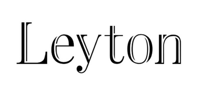
So far, these have been classic, versatile fonts suited to a range of industries. Sometimes, though, you want a business card that reflects luxury and elegance instead, and for that, an ornamental font like Leyton fits the brief. It combines serifs with a decorative, embossed look that’s beautiful yet still genuinely readable, making it a strong option for fashion, hospitality, or other boutique brands. Licensing note: the single-weight version is free for personal use, but commercial use requires purchasing the full version from Creative Market.
Black Caviar

If you want your card to feel personal and handmade, a script font can add real warmth, popular with wedding vendors, fashion brands, and artisan businesses. The catch: even the most beautiful script font must stay readable to be effective. Black Caviar strikes that balance well, using thin strokes and wide letterforms to stay legible despite its handwritten style. Licensing note: This is a paid, commercial font available via Creative Market. Budget for the licence before committing your design to it.
Using Font Weight and Size for Hierarchy
Most business cards include at least three tiers of information: your name, your job title or company, and your contact details, and they shouldn’t all carry equal visual weight. A common, effective approach:
- Your name gets the most visual weight, either the largest size or a bolder weight of your chosen font.
- Job title and company name are set in a medium weight and size, present but clearly secondary.
- Contact details (phone, email, website) can be the smallest and lightest, still fully legible, but visually quieter.
Rather than introducing a second typeface to create this hierarchy, using different weights of the same font family (light, regular, bold) usually looks more considered and cohesive. For specific size recommendations, see our guide to business card font size.
Why Some Fonts Print Better than Others
A font that looks crisp on your screen doesn’t always reproduce identically on paper. Thin strokes and fine decorative details, the kind found in elegant serif fonts like Baskerville or ornamental fonts like Leyton, can lose some of their sharpness once printed, particularly on textured or uncoated stock, or with finishes like foil or embossing, where very fine lines can be harder to reproduce cleanly than bold, simple strokes.
If you’re considering a speciality finish for your card, it’s worth choosing a slightly bolder weight than you might otherwise, or requesting a physical proof before committing to a full print run. What looks perfect on screen doesn’t always translate exactly once ink meets paper.
Choosing by Industry: A Quick Guide

- Legal, financial, academic: Times New Roman or Baskerville, classic and credible.
- Tech, startups, modern brands: Futura or Helvetica, clean and contemporary.
- Design-led or creative agencies: Myriad Pro, or a more distinctive choice if your brand can carry it.
- Luxury, fashion, boutique retail: Leyton, elegant without sacrificing readability.
- Weddings, artisan trades, personal brands: Black Caviar or a similar script, warm and handmade in feel.
A Quick Note on Font Licensing
Several of the fonts above (Myriad Pro, Leyton, Black Caviar) are commercial or restricted-use typefaces, and “free to download” doesn’t always mean free for a business card you’re printing to represent your company. Check the specific licence terms before finalising your design, particularly for Myriad Pro, as a surprising number of “free download” sites are distributing it illegally.
FAQs
What’s the best font for a business card in a traditional profession, like law or finance?
Times New Roman or Baskerville both convey classic professionalism and credibility, well-suited to industries where a traditional, established feel matters more than standing out.
Is Myriad Pro free to use on a business card?
No. Despite many websites offering “free downloads,” Myriad Pro is a commercial Adobe typeface and requires a proper licence, available through an Adobe Fonts subscription, for commercial use. Open Sans is a widely used free alternative with a similar feel.
Can I use a script font like Black Caviar on a business card?
Yes, but choose carefully. Script fonts can quickly become hard to read at business card size. Black Caviar is specifically designed with wider letterforms to stay legible despite its handwritten style, making it a safer script choice than most.
What font should I avoid on a business card?
Avoid highly decorative or tightly spaced script fonts not specifically designed for small-size legibility; anything that looks striking on a screen at large size can become illegible once printed at actual business card dimensions.
How many fonts should I use on my business card?
Stick to one font family, using different weights (light, regular, bold) to create hierarchy between your name, title, and contact details. Introducing a second typeface rarely improves a business card and often looks unplanned rather than deliberate.
Should my business card font match my logo or website?
Not necessarily exactly, but it should feel consistent. A business card using a completely different style of font from your website or logo can create a disjointed impression, even if each element looks fine on its own.
Can I use any free font I find online for a business card I’m printing for my business?
Not always. “Free” often means free for personal use only; commercial use, including a business card representing your company, frequently requires a separate paid license. Always check the specific terms before finalising your design, as demonstrated by Myriad Pro above, some sites distribute commercial fonts as if they were free when they aren’t.
Should I use a bold or regular weight for my name on a business card?
A bolder weight for your name helps it stand out as the most important piece of information on the card, while keeping your job title and contact details in a regular or lighter weight creates a clear visual hierarchy without needing a second font.
Making Your Final Choice
There’s no single “best” font for a business card, only the one that best matches the impression you want to make and the industry you’re in. Start with legibility as a non-negotiable, then let your profession, your brand, and how the card will actually be printed guide the rest. A well-chosen font, even a familiar one like Helvetica or Times New Roman, will always outperform a striking font that’s hard to read or poorly licensed.
Whichever font suits your industry, we print business cards from £4.95, on 400gsm, 450gsm, or recycled stock, with dispatch within 1 working day. Browse our templates or upload your own design to get started.