Complete Guide To Booklet Layout And Design
Creating a booklet that’s attractive and easy to digest is no easy task. Whether you’re designing a business brochure, event program, or lookbook, your booklet layout should tie all your content together to make a cohesive finished product that’s easy for the reader to understand.
Poor design is easy to spot and can spell disaster for your brand. Read on to learn what makes a good booklet layout and how to achieve it yourself.
What Makes a Good Booklet Design
Many factors go into making a layout design that grabs the reader’s attention. The most important thing to remember is to cover all the points of composition and not overlook any minor details.
From the paper size, page design, and margins to the color, font, and spacing, there are many things to consider when designing your booklet layout. Also consider how to incorporate any illustrations or graphics you want and how the front cover and inside pages will look. Cohesiveness is a must.
Tips for Creating a Great Booklet Layout Yourself
A great booklet layout takes some work and planning, but the results are worth it. When executed correctly, a booklet layout entices the reader to learn more, makes the details within the booklet easier to digest, and improves current and potential customer perception of the brand.
Create an Outline
To create a great booklet layout, you first need to map out the project. To ensure your booklet is high quality, you want to create an outline. This process helps guide your work and ensures you stick with a logical flow. As you create the outline, remember that experimenting with various options can provide great design inspiration and helps you find the best editorial design for your booklet. Some things to experiment with include page layouts, page size, margins, graphics sizes, booklet templates, and different graphics. It helps if you have a background in Adobe inDesign or graphic design, but anyone is capable of designing their own great layout.
One rule of thumb to follow is: don’t minimize the margins. Your recommended margins should be .8 for the binding edges and .5 for the outer three edges. Don’t forget to develop a header structure and stick with it, such as H1, H2, H3, and H4.
Find a Typeface That Works for You
Typography not only enhances the appearance of the booklet but helps to organize it in a manner that readers can better digest. In fact, choosing the wrong font can give the reader a headache!
Here are a few tips: stay away from Microsoft Office default fonts and overused fonts such as Comic Sans, Arial, Helvetica, and Papyrus. To get the best results, consider hiring a professional typographer or graphic designer, as they specialize in spacing and creative design. Don’t forget to keep font size and headers consistent and set the rule for their use at the beginning of the planning stage.
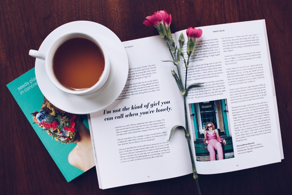
Use Only High-Quality Images
High-quality images help connect the reader to the content, break up the format, and make the overall look more appealing. To get the best results and ensure images are high quality, be sure to use at least 300 dpi (or 200 dpi at the lowest) for the value.
Try to use images that express the message you’re trying to convey to the reader, and do your best to include something eye-catching and relatable. Consider using bold colors or striking, clear images for the most positive effect.
The Small Details Matter
You have heard that the details always matter, and this is especially true when you’re creating a booklet. Pay close attention to the small details throughout the booklet to make the finished result look professional and reputable.
One point of interest is the page count or the size of the booklet. Try to aim for a well-developed finished product with plenty of information to boost how readers perceive your company.
Before you get started, plan out the color scheme you want and stick with it throughout the publication. Try mixing up the border colors and page colors within the same scheme to add appeal.
Don’t forget to view the booklet in a page spread to check for cohesion and inspect the page layout. You should also include page numbers regardless of the booklet’s size, even if it’s an 8-page booklet, and include a table of contents if your booklet has multiple sections. Also, consider all the information the reader needs to know. Some examples include pricing details and social media sites.
Preview Before Print
When you’re creating a booklet, you absolutely need to preview it before you print. This proofreading process is the best way to catch errors and make editing decisions before it goes to press. In fact, this process can help avoid sudden discoveries after you’ve already printed a few hundred copies.
One crucial point to address is the printer spreads. It’s important to know that they’re not in consecutive page order but appear consecutively once the pages are folded into booklet form. Printer spreads vary based on the number of pages in the publication. An example of an 8-page booklet printer spread is 8/1, 2/7, 3/6, 4/5. Always double-check to ensure the pages are printed in the correct order.
Printing Your Booklet
If you want to create a good booklet layout, you need to plan your strategy. Spend enough time on the design, color scheme, and fonts because these features catch the reader’s eye and entice them to read the content within.
Consider a printing service like BananaPrint for your booklet printing. We can provide design templates, printing previews, and have the shipment to your location quickly so you’re not stuck waiting.
With some pre-planning strategy and attention to detail, you can create a beautiful booklet that helps elevate the readers’ interest and promote the reputation of your organization, company, or brand.