CMYK Colours for Print: Your Complete Print-Safe Colour Guide
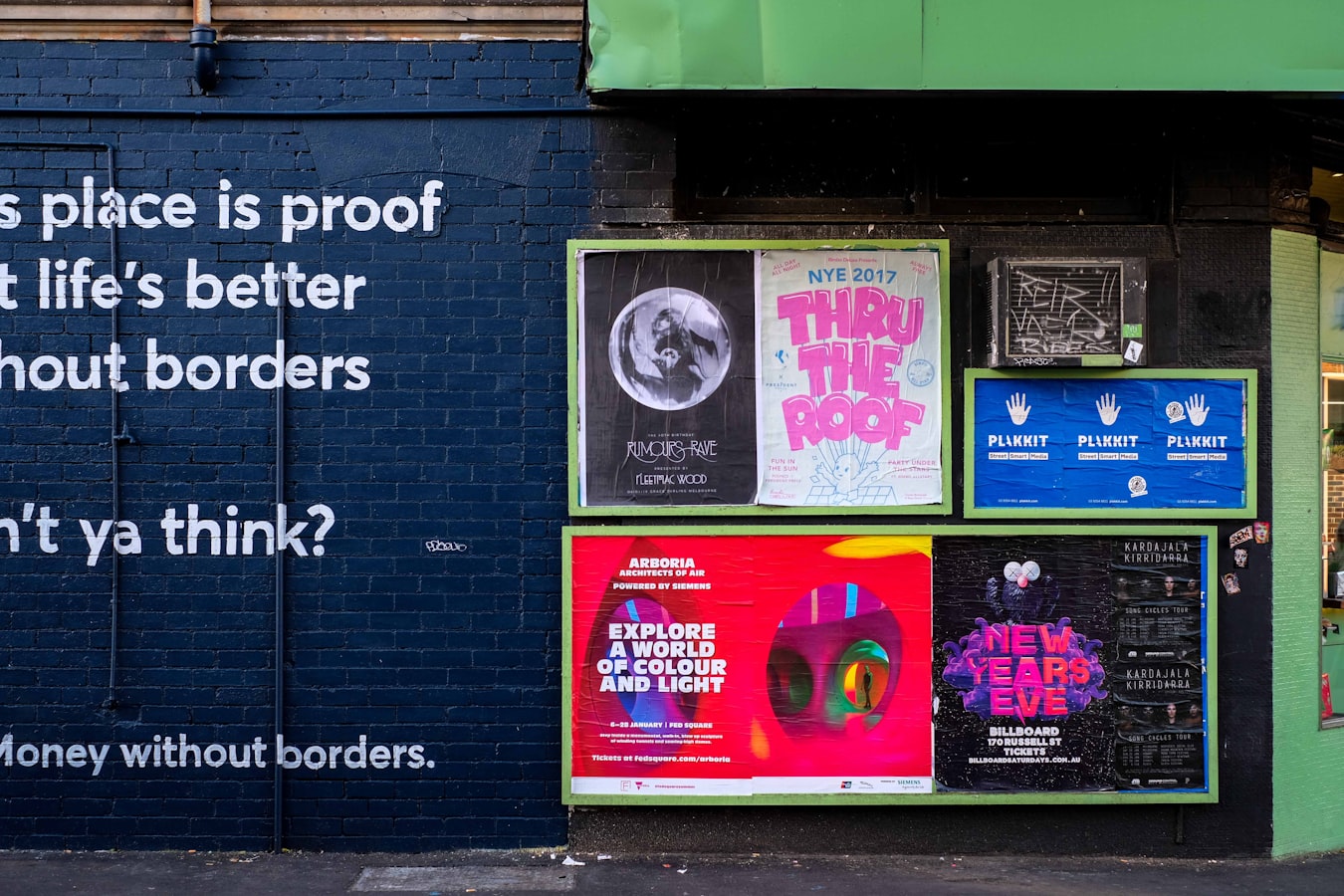
Posters are important in print advertising, especially in local promotions for which you’re focused on driving foot traffic. In fact, the first documented printed advertisement dates all the way back to the 1400s! With such a long and storied history, posters have proven their worth as a marketing tool — but only if they’re used correctly.
Today’s adverts have to compete with many more distractions than their 15th-century ancestors. If you want your poster to cut through the noise and catch your audience’s eyes, you’ll have to use every graphic design trick in the book. How do you do it? The best way to start is with the right colour scheme.
The Importance of Colour in Print
Choosing your printing colours is an essential part of the design process. Colours have many roles to play in poster design: they set a tone for the poster, help determine the style, and help the design look more attractive. But perhaps most importantly, colours can help trigger an emotional response in your audience.
Most people associate the colours of the rainbow with different emotions. For example, the colour red is often a symbol of passion, ferocity, and vitality. By comparison, the colour blue tends to elicit feelings of serenity and calm (or in some cases loneliness).
If you design your poster with the connotations in mind, you can create marketing materials that connect your poster — and by extension, your company — with any feeling you want to stir up in the viewer. As most people are emotional decision-makers, this little trick of marketing can help draw people into your business and ultimately encourage them to make a purchase.
Why Use CMYK?
If you are designing a printed poster, it’s essential that you use CMYK colours in your design. CMYK stands for the four toner colours used in professional-grade printers: cyan, magenta, yellow, and key (another term for black).
CMYK colours are different from those you see on your television or computer monitor. Electronic devices use an RGB (red, green, blue) colour palette, which combines these three primary colours to create the coloured light you see on the screen. However, RGB colours tend to be rather dark; this is fine on a screen that is literally lit up, but on a printed page it can result in a muddied, muted finished product.
By contrast, CMYK inks are much lighter than RGB shades. This means they can combine to produce a wider range of colours that they will be much more vivid when printed. This is why CMYK is the current standard for professional printing — and why that standard is unlikely to change anytime soon.
When you design a printed poster, make sure you convert your colours to CMYK before sending the finished file to the printer. This will ensure that your poster looks just as lovely as you imagined once it’s complete.
The Perfect Printing Colours
So, you’re sitting down at your computer, Adobe Illustrator open to a blank page, ready to start designing your poster. You know that you need to pick CMYK colours… but which ones should you choose? The answer will depend on the emotion you want the viewer to feel. Here are a few common examples:
Red and Yellow
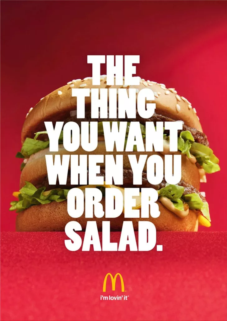
Have you ever noticed that nearly every fast food establishment on Earth uses red and yellow in their signage. That’s no coincidence. It’s smart marketing! Studies have shown that the colour red increases your body’s blood flow when you see it, ultimately speeding up your metabolism and making you hungry.
Similarly, warm colours like yellow and orange have been proven to increase heart rate — another way to get your blood pumping and increase your appetite. By choosing warm, vibrant colours for their posters, restaurants are doing their best to draw you in for a quick bite to eat.
Blue and Orange
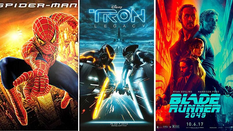
If you’ve ever looked at the movie posters lined up on a cinema wall, you might have noticed that they often stick to a similar colour palette: a cool blue and a warm orange. These two colours are on opposite ends of the colour wheel, which means they present an attractive contrast when printed together.
But of course, blue and orange aren’t just a pretty colour combination. The sharp contrast creates a feeling of excitement — and the viewer can sense it. If you want to generate buzz over a grand opening, a big sale, or any other special event, this colour scheme can help build anticipation.
Shades of Green

Many businesses today use their marketing materials to highlight their environmental efforts. As climate change and other eco-issues persist in the public consciousness, eco-friendly products and companies have become more and more important. But how can you tell your customers that you’re a “green company”? The answer is right there in the name!
Using shades of green in your poster printing is a great way to evoke a sense of health, wellness, and environmentalism. Whether you’re trying to promote eco-friendly products or advertise your businesses’ green practices, this is the perfect colour to convey your connection to the planet.
Black, White, or Silver
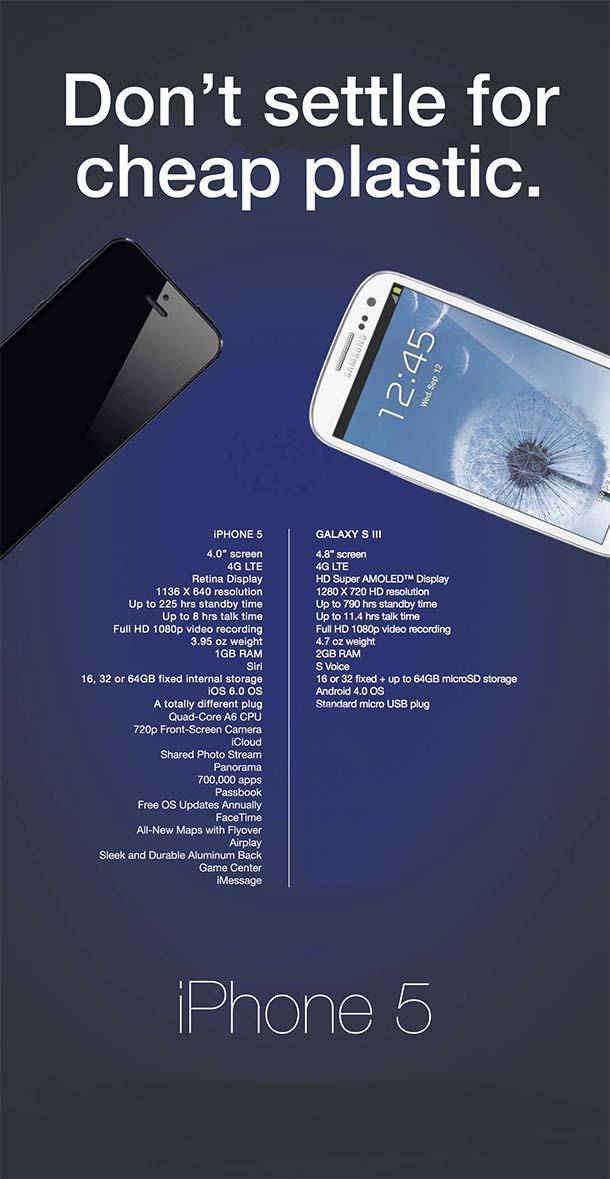
Think about the last tech-related poster you saw — perhaps an ad for Apple or a banner advertising the latest electric car. It was probably sleek, minimalist, and predominantly black and white. If you want to convey a sense of sophistication or innovation in your poster, this classic colour scheme is the best way to do it.
Thanks to decades of science fiction movies, silver is usually associated with futurism and technological innovation, which is why so many companies use the colour in their posters. Additionally, don’t be afraid to use plenty of white space (empty space with no design) in your poster. Plenty of white space can be an effective way to draw the eye anywhere you want them to look.
Design Professional Posters
Anytime you need to create a beautiful printed poster for your business, it’s important to do a few different things:
- Choose the right colours
- Use CMYK for your design
- Get a professional printer to handle the job
An online printer like Banana Print can help you turn your poster from a mere idea to a stunning marketing tool. Explore our poster templates today to see how we can help expand your business’ reach!