Tri Fold Brochures: Effective Ways to Design & Print Brochures
If you’ve ever been to a trade show, received a pamphlet from your doctor, or gotten a direct mailer advertising a new business, you’ve probably encountered a tri-fold brochure. This simple marketing material is a tried and true way to present information about your company, whether you’re advertising a grand opening or introducing a new service or product line.
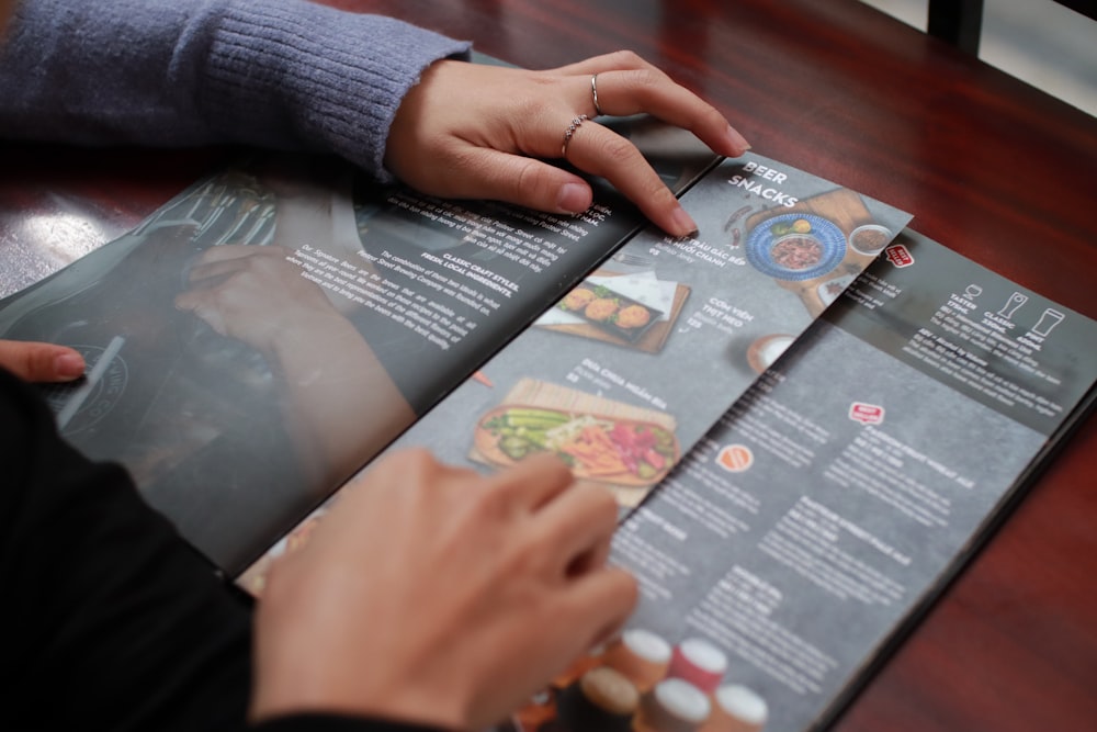
But like all marketing materials, a tri-fold brochure is only effective if it’s easy to read and understand. This is one of the tri-fold’s greatest strengths; its very design easily divides the paper into panels, giving copywriters and designers distinct spaces to discuss various topics.
But how can you make sure that your tri-fold brochure is effective? Here are a few tips to help you design the ideal brochure:
When Should You Use a Tri-Fold Brochure?
Firstly, it’s important that you only use a tri-fold brochure when it’s appropriate. This type of marketing material is best when you want to present your readers with a lot of information. The panels can help divide your content into digestible chunks, thereby making it easy to absorb (and remember later on).
For example, a tri-fold brochure is the perfect way to inform your audience about your business as a whole. By contrast, marketing materials that advertise a specific element of your business (such as a weekend sale or a product launch) might be better served with a bi-fold or z-fold flyer.
Tips for Your Tri-Fold Brochure
Once you determine that a tri-fold brochure is ideal for your marketing campaign, you will have to design a layout that’s attractive and unique, while also being easy to read. How do you do it? Here are our tips and tricks to creating the ideal tri-fold brochure.
Remember Your Pagination
Your tri-fold brochure needs to be easy to read — and that means you need to number the panels correctly. Pagination for a tri-fold brochure isn’t as intuitive as you might imagine; because of the folds in the page, the numbers aren’t exactly chronological.
If you were to lay a tri fold brochure flat in front of you, the pagination would look like this:
- Facing you: pages 2, 3, and 4
- Reverse side: pages 5, 6, and 1
Keep this order in mind when designing your brochure and creating your mockup or sample. This will help you maintain a sense of flow and order in the finished product.
Keep Your Panels Distinct
As we’ve already discussed, one of the benefits of a tri-fold brochure is the ability to divide your work into separate and distinct sections with each panel. This allows you to discuss several aspects of your business (company mission, history, services, etc.) without overwhelming your audience.
However, this is only effective if you keep the content on each panel distinct.
Make sure to refine your copy so that it doesn’t extend beyond its designated panel. This will keep each section of your brochure separate and succinct, which will result in a better reading experience for your audience.
Play With Colour
Another way to reinforce your separate panels is to play with contrasting colours. Your layout can use different shades for each panel (or rotate between a few key colours) to create a stark contrast and visual interest for your brochure. This will result in a beautiful-looking piece that’s sure to catch that eye.
Playing with colour is also a quick and easy way to enhance your brand recognition. Use colours that match your website, logo, and other marketing materials to create a palette that can become synonymous with your business. This subtle marketing can be a great way to make your company stand out from the competition.
Break Up The Text
We mentioned earlier that tri-fold brochures are ideal for presenting a lot of information to your audience. This is true — but that doesn’t mean you can present the information all at once. If your brochure contains large walls of text (particularly if the font is tiny), you’re bound to lose your audience’s interest in a matter of moments.
How can you deliver key info without boring your reader? Break up your text with engaging images. This is a useful trick for separating text into smaller, digestible sections — and images can help add another layer of interest to your brochure.
Simplify Your Font Selection
Finally, anytime you design a brochure (or any marketing material, for that matter), it’s important to simplify as much as you can. It’s true that you don’t want to have a boring brochure, but too much going on will overwhelm the eye and make your reader less likely to take a second look.
One of the best places to keep things simple is with your fonts. At most, you should use two or three fonts in your brochure (one for titles and headers, one for body copy, perhaps one more for your company logo). Use a classic, readable font (you don’t want your audience struggling to make out the text) and use a large enough font size for easy reading.
Use a Template For Easy Designing
Creating a brochure might seem overwhelming for a novice, particularly if you’re unfamiliar with graphic design. Brochures are an important form of marketing — but if you’re new to the design game, how can you be sure your brochure will be effective?
You’re in luck: these days, most online printers offer online templates to help you get started with your marketing materials. You can choose a template that best suits your business, then fill in the blanks with your own text and images. This is a great choice for individuals who want to create a great brochure, but aren’t exactly sure where to start.
Whether you customise a ready-made template or upload your own design, Banana Print can help you create high-quality printed materials that will promote your business in the best way possible. Take a look at our brochures, personalised gifts, posters and more to see how we can help you today.