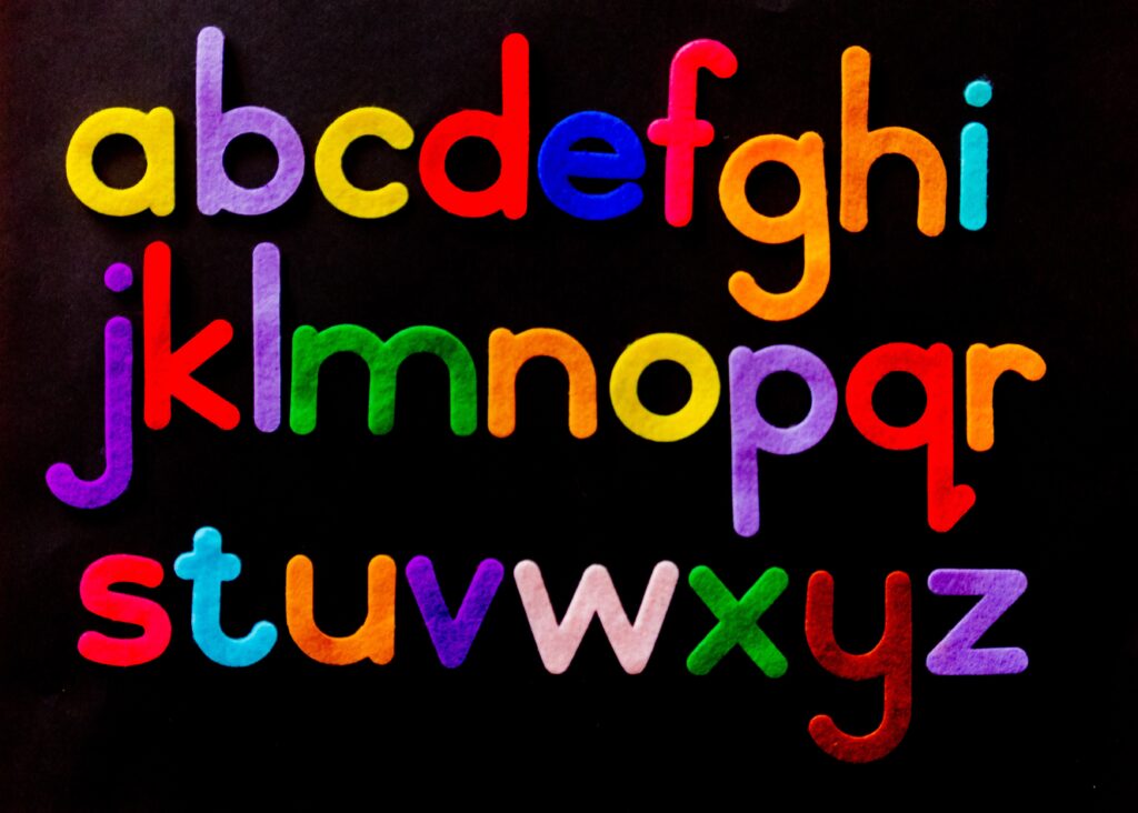
Fonts in Print: Why It Matters and How to Choose the Best and Avoid the Worst
One of the most crucial, albeit overlooked, aspects of printing is font. Many brands focus on the colours and other aspects of graphic design and forget the design of the letters.
Typography holds a lot of weight on the overall feel of a brand and can affect the readability, feeling, voice, and message of your brand. Good font sets the mood and tone of your message. If you have pretty marketing brochures written in a bad font, your campaign is as good as dead.
What Makes a Bad Font?
Some factors that make bad font include:
- Font overuse: Default fonts in popular applications like Microsoft Word and Adobe suite might work for a class project, but are too plain for a marketing campaign.
- Boring fonts: Some fonts just don’t stand out. To convey a certain tone and personality, the right font choice is both crucial and incredibly hard to achieve, which is why so many brands opt for professional typographers.
- Failure to meet the purpose: Fonts used in comic books and movie posters aren’t ideal for company letter head, for instance.
- Poor spacing: Poor spacing is a telltale sign of bad typography. Not only does it compromise readability, but it can also make your brand look ill-conceived and underdeveloped.
Worst Fonts for Print
Some of the worst fonts for print include the following.
Brush Script
This is a casual typeface that has the handwritten look of an ink brush. Though more nostalgic people may be attracted to this familiar font, most will recognize it as cheesy, outdated, and overused.
Arial
Arial was once the default Microsoft Word font, but the company replaced it in Office 2007 with Calibri. This font is okay for internally disseminated printed materials, but because of its overuse, Arial is a terrible choice for company branding and marketing materials.
Times New Roman
12 point Times New Roman font seems to be the default font for everything, and widely overused as a result. Times New Roman has the added disadvantage of being the mandated font for essays and term papers through all levels of schooling, which conjures bad memories for many.
Calibri
Calibri is a very common font, and as the default font in Microsoft Office, it can leave your printed materials looking lazy and amateurish.
Comic Sans
Comic Sans has been around since 1994 and is inspired by comic book typeface. Designers around the world hate this typeface because of its poor readability, and most people might not take it too seriously.
Copperplate Gothic
Copperplate Gothic borrows inspiration from ancient Roman carvings and Victorian Era printing. Today, it’s an outdated typeface that your audience might consider boring and hard to read.
Papyrus
People have used Papyrus to a point where your audience might react negatively to your printed marketing material in this font. It came preloaded with MS Word and is now one of the most overused fonts. Your promotional content requires some originality, and that’s a good reason to avoid Papyrus for your print work.
Trajan Pro
Trajan Pro isn’t necessarily a bad font, but it is overused. From book covers to movie posters, this typeface appears everywhere, and this makes it a poor font for your printed materials if you care about originality.
Courier
Courier is ideal for screenplays, code, and plain text documents, but when it comes to print work, the font’s disproportional lettering makes it a poor choice. The typewriter inspiration won’t work well for printed material that targets the Millennials and Gen Z.
Lucida Calligraphy
While readability was one of the reasons for Lucida Calligraphy, it only works best in small print. If you want to quickly pass the message across, avoid this typeface.
Verdana
Released in 1996, Verdana quickly became a popular alternative to Arial, but for print, it’s one of the ugliest fonts out there.
What Makes a Good Font for Print?
Font choice can make or break your branding or promotional campaign, so from signage to mailers to in-store and product labels, all of your brands printed materials need a great, cohesive font. The best fonts go beyond aesthetics and express emotion, mood, professionalism, and personality.
Your audience should instantly get the message of your printed works. With stiff competition in every industry, you want to captivate your target audience with an aesthetically appealing font without compromising on legibility.
When choosing fonts for print, consider consistency in the letters, numbers and all characters, good balancing, and kerning. Avoid outdated typeface and go for a modern look with fonts like sans-serif fonts.
The Best Fonts for Print
Here are some of the best fonts for your printing projects.
Avenir
Avenir is one of the most reliable and effective typefaces for print work and has been around since 1988. The sans serif typeface is popular in corporate branding because the font is very legible.
Futura
Futura has a clean, geometric style, which makes it perfect for print. It borrows from the German Bauhaus design style, and the slender letter shape makes it easy to read. The typeface is also clean and professional and ideal for promotional materials.
Helvetica
Helvetica has been around since 1957 and is one of the most commonly used type fonts. This font’s clean design makes it ideal for print where you need detailed information.
Garamond
Garamond is a serif font ideal for printed materials because of its elegance and readability.
Tahoma
This is another popular sans-serif typeface with a humanist style developed for Microsoft. It has a modern look, which gives your printed work a stylish touch but still appears professional.
Swiss
Borrowing inspiration from the Swiss style, Swiss typefaces boast cleanliness, readability, and objectivity. This font’s grid-based design increases its legibility and makes it perfect for print.
Cambria
Cambria is a serif font which is easy to read in print because of its even spacing and proportions.
Didot
Didot is a Neoclassical serif typeface characterised by vertical stress, hairline strokes, stroke contrast, condensed armature, and flat, unbracketed serifs. This is one of the most popular printing and branding typefaces for magazines, billboards, and brand logos — Giorgio Armani, Zara, Hilton, Dior, Yves Saint-Laurent, and Guess all use this font.
Georgia
Designed in 1993, Georgia is a serif typeface which perfectly fuses elegance with legibility, making it ideal for print. It’s a fun and contemporary font perfect for corporate branding.
Picking the Best Font for Your Project
To choose the right font for your print project, think function, target audience, legibility, readability, modern look, and your brand’s personality. A good font blends aesthetics with function. Bad fonts looks dated, unprofessional, and misrepresent your brand’s personality.
Looking for the best font for your project? Take your project to the next level with the most innovative range of custom design and printing solutions from Banana Print.