The 9 Easiest Fonts to Read on Business Cards, Flyers, and Posters
Anytime you write something — an email to your boss, a post on your Facebook page, a birthday card to your nan — you probably spend some time making sure your message is readable. After all, if your audience can’t understand what you wrote, your message won’t be any use!
Readability is especially important when creating business materials like business cards, flyers, and posters. Potential clients, colleagues, or customers will only respond to your message if they can read it — which is why a simple, clear font is just as important as well-written copy. Anytime you create printed materials for your business, it’s essential that you use the easiest font to read on paper.
But what is the easiest font to read? The answer depends on the type of marketing material you’re creating. Let’s look at a few readable font options.
Serif or Sans Serif?
When you’re choosing a readable font for your marketing materials, you’ll first want to decide if you want to use a serif or sans serif typeface. What’s the difference?
Serif typefaces include little decorative flourishes (called “serifs”) at the end of each stroke. Think about classic fonts like Times New Roman or Georgia; these fonts have serifs at the edges of nearly each letter. By comparison, sans serif fonts omit these flourishes for a clean, minimalist letter design. Fonts like Helvetica or Arial are popular sans serif fonts.
The decision between serif and sans serif fonts may seem minor, but these details can make a huge difference in your finished product. The right font can reflect your brand identity (serif fonts typically seem more traditional or sophisticated, while sans serif fonts appear more modern). It can also affect how easy your document is to read.
Fonts for Your Business Cards
The average business card size is rather small (85 mm wide x 55 mm high in the UK). But despite this small size, an effective business card needs to contain a lot of information — your company name, your name and job title, contact information, and more. For this reason, simple, minimalist fonts are the easiest to read in this format. Consider using one of these:
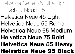
Helvetica
Helvetica is a sans serif font developed by Swiss typeface designer Max Miedinger in 1957. It features tall, thin letters with tight spacing, which makes it easy to read both at a distance and on small printed material. Helvetica is also a clean and professional-looking font, making it a great choice for material you’ll share with colleagues and co-workers.
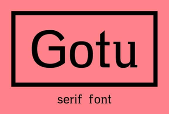
Gotu
Sans serif fonts are a popular choice for business cards because they are easy to read. However, this doesn’t mean that serif typefaces are off limits; Gotu, for example, is a great option for people who want to use classic fonts on their business cards. This font is soft and elegant with only the slightest hint of serifs on each letter, which makes it both readable and sophisticated.
Futura
Futura was originally released in 1927, but this font has a timeless quality that makes it seem very… well, futuristic. The ultra-thin character strokes and large, geometric letters are ideal for a business card — your audience will be able to read everything clearly when you use Futura.

Fonts for Your Flyers
Unlike business cards, flyers have a little more space on which the graphic designers can work. In fact, flyer designs can play around with a variety of font options: they can use different weights (or even different fonts) to create a unique and eye-catching design. However, if you want to use one font for all your printed flyers, you’ll want to stick with something that’s universally readable — like these:
Century Gothic
Century Gothic, which was released in 1991 by Monotype Imaging, is largely inspired by Futura. Like its predecessor, this sans serif font uses wide, geometric letters to create a modern look. However, Century Gothic does have one advantage over Futura: it has an even taller x-height, which means its lowercase letters are taller than other fonts. This makes the font particularly good for larger printed material, such as flyers.

Verdana
Verdana was originally created by British designer Matthew Carter for the Microsoft corporation in 1996. This sans serif font utilizes a tall x-height like Century Gothic, but it also uses a looser spacing design and wide proportions that makes for easy reading. If you want your copy to be readable even from a distance, this is a great choice for your printed flyers.

Georgia
Three years before Matthew Carter created Verdana for Microsoft, the company commissioned him to create a traditional, Scotch Roman-inspired font that would be ideal for printed materials and digital documents. The result was Georgia, a serif font with a tall x-height and thin strokes that looks great just about anywhere! If you want a font you can use across all company documents from your website design to your printed flyers, this is a great choice.

Fonts for Your Posters
Readability is also important when you’re designing printed marketing materials — but when you’re designing something large like a poster, you have much more space to get creative with your poster fonts! Poster designers need to choose fonts that are both easy to read and big enough to fill the allotted space. If you need a font that really stands out for your next poster, consider one of these:
Garamond
Garamond is one of the oldest fonts we have, which means you’ve likely seen it on more than a few printed documents. It is named for sixteenth-century Parisian engraver Claude Garamond and features a low x-height, clear stroke contrast, and a subtle, sloping serif on letters like “d” and “r.” Garamond is a classical-style font, making it a great choice for any poster meant to evoke a sense of sophistication, elegance or luxury.

Bodoni
While the Bodoni font family was first designed in the late 18th century, these fonts have seen a resurgence in popularity in modern times. This is likely because the font, with its elegant serif lettering and thick strokes, creates a bold look sure to draw attention on printed materials! However, if you decide to use Bodoni in your brand materials, it’s important to remember that this font is ideal for a range of printed materials; on a screen, the contrast in strokes can make certain letters harder to see.

Clarendon
Clarendon was first released in 1845. This bold serif typeface has a classic look, but it also possesses the readability of more modern fonts. If you want to make sure your audience can read your poster — even from across the road — Clarendon might be your top font choice.

Of course, whether you’re designing a business card, flyer, poster or any other business materials, font choice is only the beginning of your journey. Thanks to Banana Print, you can create professional-quality documents that are easy to read, beautiful to look at, and easy on your budget! Take a look at the many options we can offer your business today.