Menu Design Made Easy: 5 Ideas, Inspiration, and How to Design Your Own
Anyone who has ever wanted to open a restaurant should know this: the restaurant industry is a crowded place. In 2018, there were over 88 thousand restaurants operating in the UK alone! To Succeed in this business, you need to have both excellent food and a great dining atmosphere — and that means having well-designed menus.
But what makes a restaurant or cafe menu “well-designed”? The answer depends on the kind of establishment you run. Different types of restaurants require specific kinds of menus, so today we’ve gathered some cool menu designs to inspire you as you’re creating restaurant collateral and printed marketing materials.
How to Design a Menu in 5 Easy Steps
- Design with “eye-scanning patterns” in mind
- Separate your menu into sections (and make those sections make sense)
- Minimize (or eliminate) currency signs
- Use appropriate and appetizing colours
- Use photos sparingly — and make those photos exceptionally beautiful
Great menus generally follow these guidelines to make sure their menus are both beautiful and easily readable.
Now that you understand the basics of menu design, let’s look at some restaurants that use these rules — and a little extra creativity — to create something truly special.
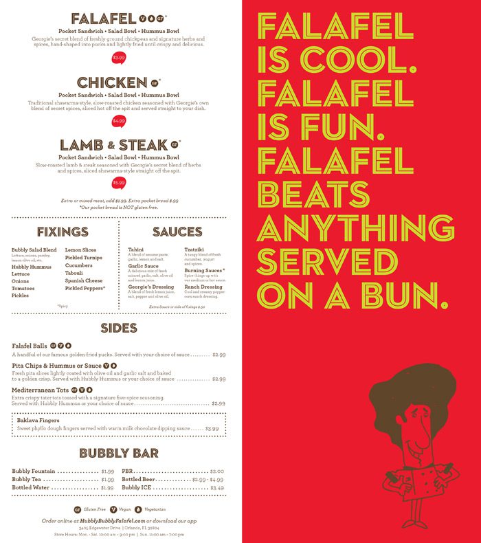
Hubbly Bubbly: Orlando, USA
This menu is a masterclass in rules two and four. The restaurant (Orlando’s Hubbly Bubbly) sells falafel in a variety of ways, with countless combinations of meat options, fixings, and sauces. Rather than listing every possible option, the designer separated the menu into manageable sections, which makes it easy for diners to determine which combination of goodies will satisfy their appetites.
Additionally, this menu takes a page from the fast food playbook and uses a classic colour scheme of yellow and red. According to psychologists, seeing the colour red tends to make people feel hungrier — so choosing a bold red cover for their menu is a great way to ensure that your patrons start feeling peckish. Hubbly Bubbly’s menu is a simple one, but it certainly gets the job done.
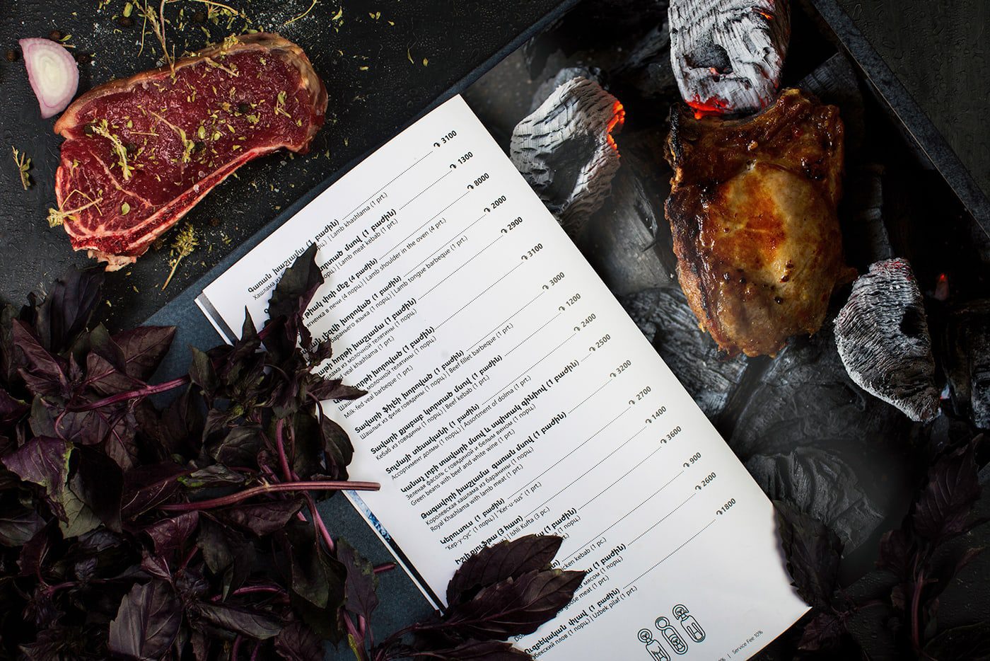
Vostan Restaurant: Yerevan, Armenia
It may seem counterintuitive to omit photos from your menus. After all, you eat with your eyes as much as your taste buds; showing your patrons a photo of something tasty is a great way to pique their interest. However, great food photography isn’t cheap! It’s actually best to limit the number of photos in your menu — and when you do use photos, make sure they are the best of the best.
This menu from Armenian restaurant VOSTAN is a perfect example of cool menu design. The menu itself is fairly sparse and minimalist. It simply lists the restaurant’s dishes, briefly describes them, and lists the price. But on the opposite page, the restaurant has printed a spectacular photo of a juicy slab of meat! Most pictures say a thousand words, but this one says only one: YUM!
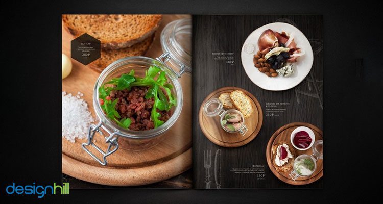
RAGU Cafe: Novosibirsk, Russia
Rule number five of our menu design basics is “Use photos sparingly” — but sometimes, rules are made to be broken. Russia’s RAGU Cafe manages to break this rule to great effect. Instead of taking it easy on the photos, RAGU fills their menu with colorful, appetizing pictures of their small plate selection. This allows diners to know exactly what they’re ordering, even if they don’t speak or read Russian.
Of course, it is important to note that these photos are rendered in impeccable print resolution. The colors are vibrant, the food styling is superb, and everything contrasts nicely with the matte black background. These designers clearly focused on their use of color, space, and imagery, which resulted in a very unique and cool cafe menu design.
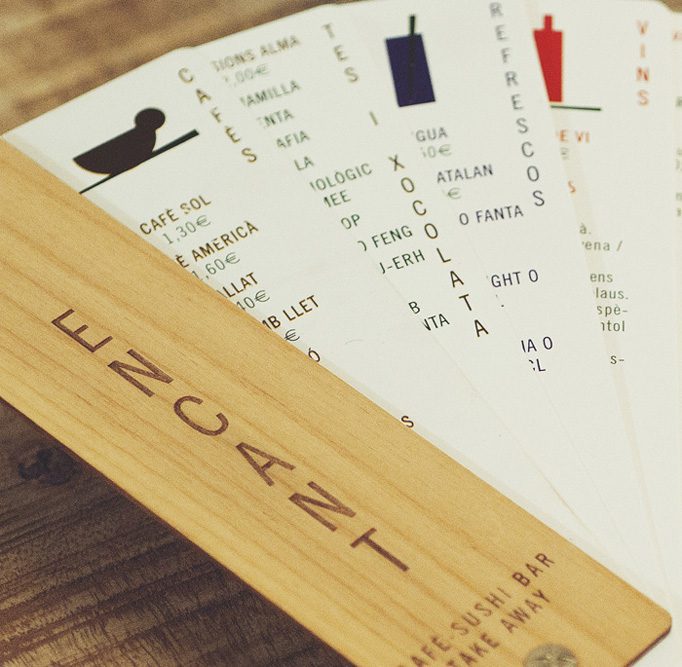
L’Encant: Barcellona, Spain
L’Encant sushi bar and café offers a unique blend of Japanese and Catalan cuisine, and they wanted a unique menu design that reflected their bill of fare. Their menu design takes inspiration from Japanese folding fans, with laser-engraved wooden boards protecting the paper parts of the menu. This fan-style menu is beautiful to look at and helps give diners a more interesting experience while they visit the restaurant.
Additionally, it’s important to mention the other ways that this menu meets certain design requirements. Each page of the menu lists dishes from a different category (rule number two), and each section features a unique color (rule number four). When a diner fans out the menu, he or she can get a complete picture of the available options at L'Encant — which is exactly what restaurateurs want from their menus.
Cà Phê Con Leche: Montreal, Canada
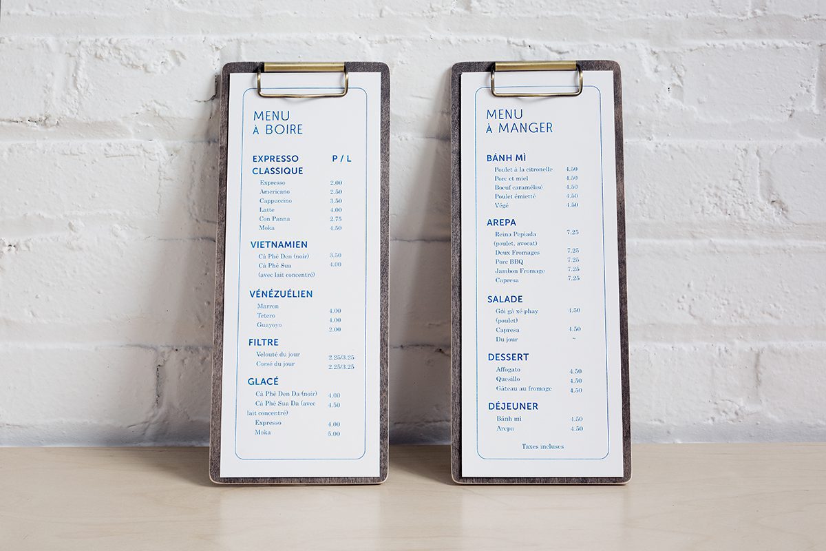
Sometimes, the best design you can choose is a simple one. That’s exactly what Cà Phê Con Leche did with their classic white menus.
Here, you can see all the menu design basics in action: the menu items are listed vertically to allow for easy scanning (#1) and divided into sections (#2); currency signs are not used, which makes guests more likely to spend (#3); the menu uses an attractive, cool blue color palette contrasted with classic and clean white (#4); and there are no photos to create a sense of minimalist sophistication.
This menu may not have much copy on it, but it communicates everything it needs to about both the dishes offered and the establishment that serves them.
Design and Print a Beautiful Menu
Whether you’re creating a bold menu filled with photos or a one with a minimalist approach, Banana Print can help you create a beautiful menu your guests are sure to adore. Contact us today to start creating your dream menu — as well as flyers, promotional materials, and much more.
