
Nine Poster Fonts That Make an Impact
First published: 25 November 2019 | Updated: 14 September 2026
The right font can make or break a poster before anyone’s even read the message on it. Sans serif fonts like Helvetica and Futura are the safest choice for readability, especially at a distance, while decorative and serif fonts like Bodoni or Lavanderia add personality and style where legibility matters a little less. Here are nine fonts worth considering, grouped by style, plus guidance on how to pick and pair them.
Quick comparison:
| Font | Style | Free or paid | Best for | Readable at a distance? |
|---|---|---|---|---|
| Franklin Gothic | Sans serif | Varies by source, check licence | Headlines, signage | Yes |
| Helvetica | Sans serif | Commercial, widely bundled | Clean, professional posters | Yes, but tight spacing at small sizes |
| Futura | Sans serif | Commercial | Retro-modern branding | Yes |
| Gilmer | Sans serif | Free for personal use, paid licence for commercial use | Branding, logos, headlines | Yes |
| Bodoni | Serif | Widely available, check the specific source | Elegant, classic posters | Only at larger sizes, high contrast fades at a distance |
| Coldiac | Serif | Commercial, check licence | Luxury branding, invitations | Yes, at headline sizes |
| Lavenderia | Script | Pay-what-you-want for personal use, paid licence for commercial use | Logos, boutique branding | No, script fonts read poorly at a distance |
| Hello Beautiful | Brushstroke | Commercial, check licence | Female-oriented, lifestyle brands | No, best for short headlines only |
| Equinox | Sans serif, uppercase only | Commercial, check licence | Sci-fi or futuristic branding | Limited, no lowercase letters at all |
Found your font? Design your poster online or browse our poster templates to bring it to life.
Sans Serif Fonts
Readability is essential for any print marketing material. If your audience can’t read your poster, flyer, or business card, they’re unlikely to remember your business or look you up later. That’s why sans serif fonts, those without the small decorative “brushstrokes” (serifs) at the edge of each letter, are generally the safest choice for poster copy, especially anything with a lot of text.
Franklin Gothic

The “father” of the sans serif font family, originally designed by Morris Fuller Benton at the turn of the 20th century for newspaper headlines. Today, it’s a go-to for billboards, movie posters, and print ads. Its wide, sturdy letterforms hold up well even at a distance, making it a genuinely strong choice for headline text on a large-format poster.
Helvetica

A long-time favourite among designers, partly because it’s widely bundled with design software, and partly because its clean, thick letterforms are easy to read. One caveat: Helvetica’s default spacing is quite tight, which can hurt legibility at small sizes. Give it a little extra letter spacing if you’re using it for body copy rather than a headline.
Futura

A clean, geometric font inspired by the Bauhaus movement (Germany, 1919-1933), managing to look both retro and modern at once. Its slender letterforms remain legible even at small sizes, which is why it’s popular for logos, body copy, and headlines.
Gilmer

A versatile geometric sans serif family with five weights plus an outline option, giving you a consistent look across a whole poster series or campaign without switching fonts entirely. Licensing note: Gilmer is free to use for personal projects, but commercial use requires a paid licence from Fontfabric, worth budgeting for if this is going on a poster you’re printing for business.
Decorative Fonts
Sans serif isn’t the only option. Sometimes a poster needs a more stylised, decorative headline font to convey a specific feeling, elegance, luxury, playfulness, or drama. These work best for short headline text rather than large blocks of copy, where legibility at a glance matters more than personality.
Bodoni

Designed in the late 18th century by Italian typographer Giambattista Bodoni, and still described by some typographers as one of the most elegant typefaces ever made. Its combination of thick and thin strokes gives it a classic, literary feel, but that same high contrast means it can lose definition at a distance or in fine print, so it’s better suited to a bold headline than dense body text on a poster viewed from across a room.
Coldiac
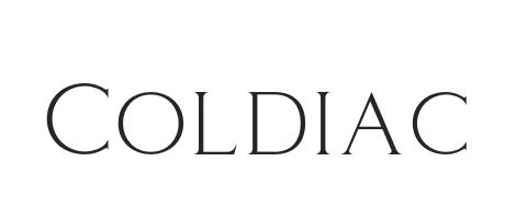
An elegant serif font with large, square-like letters, popular for materials like wedding invitations, thanks to its upscale, luxury feel. Works well at headline sizes on a poster, but check the specific licence terms wherever you’re sourcing it before commercial use.
Lavenderia
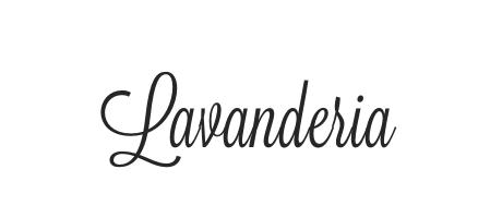
A calligraphy-style script font by James T. Edmondson, inspired by laundromat window signage in San Francisco’s Mission District. It’s genuinely beautiful and more readable than most script fonts, but like all scripts, it’s a poor choice for anything that needs to be read from a distance. Keep it to logos, taglines, or short accent text rather than a poster’s main headline. Licensing note: available pay-what-you-want for personal use via Lost Type Co-op, with a separate paid commercial licence required for business use.
Hello Beautiful

A brushstroke-inspired font family popular with female-oriented lifestyle brands, bold and eye-catching yet casual. Like Lavenderia, it’s best reserved for short headline text rather than anything that needs to be read at a glance from across a room.
Equinox

A sleek, minimalist sans serif with a science-fiction feel, good for short, punchy headlines on a futuristic or tech-forward brand. One important limitation: Equinox doesn’t include lowercase letters, which makes it unsuitable for anything beyond a short, all-caps headline; don’t attempt to use it for body copy.
Pairing a Decorative Font with a Readable One
Most effective posters don’t use just one font; they pair a decorative or characterful headline font with a clean, highly legible sans serif for supporting details (date, location, contact information). This gives you the personality of a font like Lavenderia or Bodoni, where it counts, the headline, without sacrificing readability, where it matters most, the practical details someone actually needs to act on. Helvetica, Futura, or Franklin Gothic all pair well as the “readable” half of that combination.
Related: The 10 Easiest Fonts to Read
A Quick Note on Font Licensing
Several of the fonts above (Gilmer, Lavenderia, and likely Coldiac, Hello Beautiful, and Equinox, depending on where you source them) are commercial or restricted-use typefaces. Free-for-personal-use doesn’t automatically mean free for a poster you’re printing to promote a business. Check the specific licence terms of wherever you download or purchase a font before committing to it for commercial print.
How Big Should Your Poster Font Be? The Viewing Distance Rule
A font choice only matters if the text is actually large enough to read at the distance your poster will be viewed from. A widely used rule of thumb in signage and print design is roughly 1 inch of letter height for every 10 feet of viewing distance. It’s not an exact science; different fonts have different x-heights and weights that affect real-world legibility, but it’s a solid starting point:
| Viewing distance | Approx. letter height | Approx. font size |
|---|---|---|
| 6 feet (close-up, e.g. shop window) | 0.6 inch | ~30pt |
| 10 feet | 1 inch | ~48-72pt |
| 20 feet | 2 inches | ~144pt |
| 50 feet | 5 inches | ~360pt |
If you know roughly where your poster will be displayed, and from how far away people will typically see it, work backwards from this table before finalising your headline size. A beautifully chosen font is wasted if nobody can actually read it from where they’re standing.
Choosing Fonts by Poster Type

The “right” font also depends heavily on what the poster is actually for:
- Event and gig posters: decorative or brushstroke fonts (Hello Beautiful, Lavenderia) work well for the headline act or event name, paired with a clean sans serif for the practical details, date, venue, ticket link.
- Retail and sale posters: bold, high-contrast sans serif fonts (Franklin Gothic, Helvetica) cut through best, especially for anything glanced at while walking past, like a shop window.
- Corporate and conference posters: stick to professional, restrained fonts (Futura, Helvetica, or a serif like Bodoni for a more traditional feel), decorative fonts can undercut a professional tone.
- Motivational or wall-art-style posters: this is where script and decorative fonts genuinely shine (e.g., Lavenderia, Bodoni), since these are typically viewed up close rather than from across a room.
- Directional or informational signage-style posters: prioritise legibility above all else, a clean sans serif with generous spacing (Futura, Franklin Gothic) beats anything decorative every time.
Colour and Contrast for Poster Text

Font choice and colour contrast work together; even the most legible font becomes hard to read with poor contrast against its background. As a general rule, dark text on a light background (or vice versa) reads far more easily than similar-toned combinations. Avoid pairing mid-tone colours with each other, like a medium blue on a medium grey, since they don’t provide enough contrast to stand out from a distance. If your brand colours don’t naturally provide strong contrast, consider adding a white or black outline or a drop shadow behind the text to separate it from a busy background image.
How Many Fonts Should You Use on a Poster?
As a general guideline, stick to two fonts per poster, one for headlines, one for supporting text (body copy, dates, contact details). Using three or more starts to look disorganised and undermines the sense of a considered, deliberate design. If you want variation without adding a third typeface, use different weights of the same font family (bold, regular, light) rather than introducing something entirely new.
Where to Safely Source and License These Fonts
- Google Fonts (fonts.google.com) is the safest starting point; everything there is free for personal and commercial use, no licence check required.
- Adobe Fonts is included with a Creative Cloud subscription and covers many of the commercial fonts mentioned above, including Franklin Gothic.
- Fontfabric, MyFonts, and Creative Market are common sources for the more decorative or specialist fonts featured here (Gilmer, for example, is sold directly through Fontfabric). Always check the specific licence tier before committing a font to a commercial print run.
- Whichever source you use, keep a record of your licence purchase; some commercial licences are tied to a specific number of uses or seats, which matters if your poster design gets reused across multiple campaigns.
Common Mistakes to Avoid
- Choosing a font before checking it’s legible at the size you actually need. A gorgeous script font can become unreadable the moment it’s shrunk to fit alongside other content.
- Using more than two fonts. It rarely reads as intentional, more often as unplanned.
- Ignoring contrast. Even a great font disappears against a background that’s too close in tone.
- Assuming a “free for personal use” font is free for a poster promoting your business. Check the licence before you print, not after.
- Designing at screen size without checking real-world scale. A headline that looks big on your monitor can be surprisingly small once printed at actual poster size. Always check against the viewing-distance guide above.
FAQs
What’s the best font for a poster that needs to be read from a distance?
Bold, high-contrast sans serif fonts like Franklin Gothic or Futura read best from far away. Avoid script or brushstroke fonts (like Lavenderia or Hello Beautiful) for anything beyond a short accent; they lose legibility quickly at a distance.
Can I use a decorative font for my whole poster?
It’s possible, but not usually a good idea. Decorative fonts work best for short headline text, pairing them with a clean sans serif for supporting details (dates, locations, contact information) keeps the poster both stylish and functional.
Do I need to pay for the fonts featured in this article?
Some do, some don’t. Gilmer and Lavenderia are both free for personal use but require a paid commercial licence for business use. Others, like Coldiac, Hello Beautiful, and Equinox, vary by source; always check the specific licence terms before using a font commercially.
Is Helvetica free to use?
Helvetica is widely bundled with design software and commonly used, but it’s technically a commercial typeface. If you don’t already have access to it through your design software, Arial is a very close, freely available alternative.
How big should my poster headline font be?
A commonly used rule of thumb is 1 inch of letter height for every 10 feet of expected viewing distance, so a poster viewed from 10 feet away needs roughly a 48-72pt headline. Adjust based on the specific font’s weight and x-height.
How many different fonts should I use on one poster?
Two is the general guideline, one for headlines, one for supporting text. Using different weights of the same font family gives you variation without the disorganised look that comes from mixing three or more typefaces.
What’s the difference between serif and sans serif fonts?
Serif fonts (like Bodoni or Coldiac) have small decorative strokes at the end of each letter, giving them a more traditional, formal feel. Sans serif fonts (like Helvetica or Futura) drop these strokes for a cleaner, more modern look. Neither is inherently more readable; sans serif generally holds up better at small sizes, while serif can work well for elegant headline text at larger sizes.
Can I use a font from a movie poster or an existing brand for my own poster?
Be careful here, it’s about more than just the font licence. Many film titles and brand logos use custom, bespoke lettering that was never released as a purchasable font, and recreating or closely imitating a specific brand’s distinctive look can raise trademark issues separate from typeface licensing. If you like a look you’ve seen elsewhere, look for a font genuinely inspired by that style rather than attempting to copy it directly.
What size should the body text be on a poster, not just the headline?
Body text (supporting details like dates, addresses, or descriptions) can be considerably smaller than your headline, since it’s usually read up close rather than from across a room. As a starting point, nothing on a poster should go much below 18-24pt if there’s any chance it’ll be read from more than arm’s length away, scale up from there if your poster will be viewed from further back.
Do I need a different font if my poster needs to work in multiple languages?
Possibly. Script and decorative fonts (like Lavenderia or Hello Beautiful) often have limited support for accented characters or non-Latin scripts, since they’re typically designed with a single language in mind. If your poster needs multi-language support, check the font’s character set covers everything you need, or fall back to a well-supported sans serif like Helvetica or Futura for anything beyond English.
Are there fonts I should avoid on a poster entirely?
Generally, avoid novelty or joke fonts (the kind bundled free with most operating systems) for anything representing a business or event; they tend to undermine a professional or considered impression regardless of how good the rest of the design is. If a font makes people think of a punchline before they think of your message, it’s the wrong choice.
Should my poster use the same font as my other marketing materials?
Ideally, yes, for anything representing a consistent brand. Keeping your poster’s typography aligned with your business cards, flyers, or letterhead creates a more cohesive, professional impression across everything a customer sees, rather than each piece looking like it came from a different business.
Best Fonts for Posters: The Takeaway
The right font for your poster comes down to two things: your message and your audience. Whether you want a bold, no-nonsense sans serif or an elegant decorative headline font, pairing it thoughtfully with a legible supporting font keeps your poster both stylish and effective. Once you’ve settled on a font, our poster design guide covers everything else you’ll need to get it print-ready.
Ready to bring your poster to life? Design online or upload your own artwork, printed on 170gsm or 350gsm silk paper, dispatched within 24 to 48 hours.